Project Description
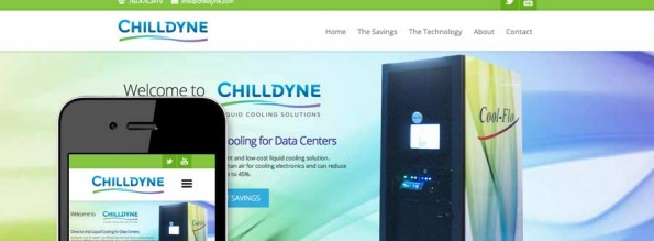
Disruptive startup company Chilldyne was ready to enter the data center cooling market with an innovative liquid cooling system aimed at eliminating inefficient air-conditioning cooling in data center environments. We selected a mobile-responsive theme with off-screen mobile navigation and a sticky header. We provided copywriting services, illustrated charts and...

Project Description
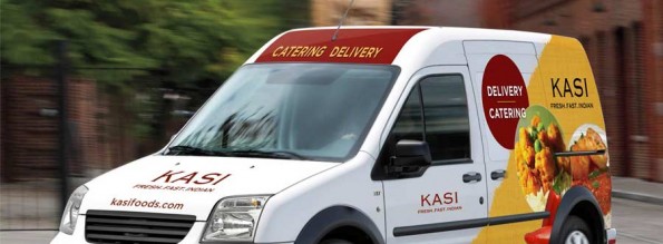
With the launch of delivery and catering services as well as the opening of their fourth location, KASI Restaurants needed branded vehicle graphics to provide a rolling billboard when they delivered customer's meals. We designed digital graphics for all sides of the delivery van. After presenting numerous layout options...

Project Description
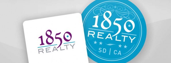
Wanting to stand out from traditional real estate brokerage firms, 1850 Realty had an idea for a badge style logo design, and also needed a business card and two signs designed. In the year 1850 the city of San Diego was incorporated and the state of California was granted...

Project Description
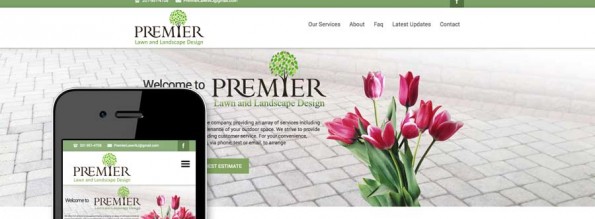
Fast-growing East Coast landscape company Premier Lawn and Landscape Design had an existing WordPress website which lacked text and project photography and was not presenting the desired level of professionalism. A mobile-responsive theme was selected that featured a collapsible mobile navigation menu as well as a sticky header. Evolution...

Project Description
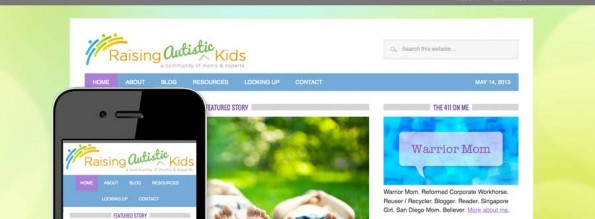
With a common tie of being parents of autistic children, the bloggers behind Raising Autistic Kids were ready to launch their blog and start building an online community. A mobile-responsive theme was selected for further customization. Evolution Design added new graphics and backgrounds, changed the colors from a black...

Project Description
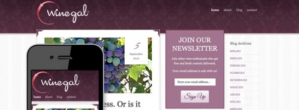
Certificatied Sommelier Winegal needed a personal blog to build her wine community in preparation for a future e-commerce site. Evolution Design created a logo design featuring a burgundy colored wine stain element. A mobile-responsive theme was selected for further customization. We added new graphics and backgrounds to create a...

Project Description
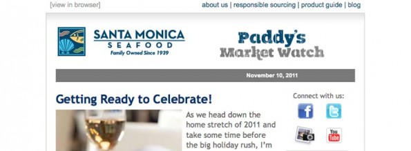
Product alerts delivered with humor by a working chef have made Paddy's Market Watch one of Santa Monica Seafood's primary customer publications, with an engaged customer list and long history as a printed flyer. After emailing versions of the flyers for years using legacy tools, the client needed a...

Project Description
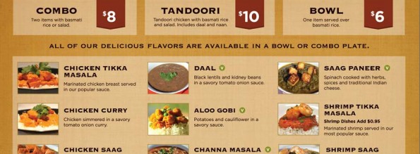
With a growing library of marketing images, KASI Foods needed to make their menu boards more readable, and adding images was a top priority. The menu board was designed to maximize the available wall space, with bold price boxes and colorful menu images. A vegetarian icon highlights the many...

Project Description
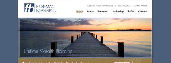
The CPAs at San Diego accounting firm Friedman Brannen had solid website content but an outdated design. Their logo and corporate identity featured a solid dark blue color for all elements. We created a custom themed WordPress website with brown and beige to complement the dark blue in the...

Project Description
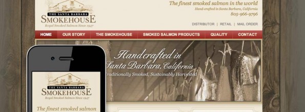
For Santa Barbara Smokehouse we created a custom WordPress site, with mobile and desktop views. Decorative content boxes and sepia tone imagery help portray a traditional feel. A customized usage guide was also created to help the client team make simple changes internally...
