Logo Design for San Diego Realtor
Standing Out in a Crowded Real Estate Market
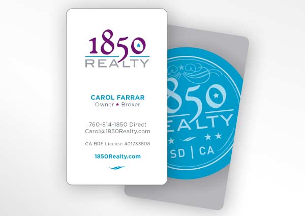
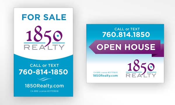
The Challenge: Wanting to stand out from traditional real estate brokerage firms, 1850 Realty had an idea for a badge style logo design, and also needed a business card and two signs designed. In the year 1850 the city of San Diego was incorporated and the state of California was granted statehood, so a historical style was desired to support the business.
The Solution: We delivered a logotype mixing traditional and modern typefaces. Cyan, bright purple and gray were used for all materials including multiple logo versions, a business card, two sign designs, and a postcard design.
Client Comments: “Bear’s service was over the top…”
“Not only did he deliver my logo in less than two weeks from my launch date, he did it with ease. We made changes on the spot & he really made sure that I was happy with each rendition. I was & still am very impressed with his level of creativity & professionalism.”
- Carol F., 1850 Realty [via LinkedIn]
Related projects:


