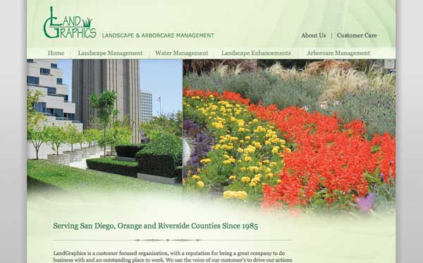
Landscape Contractor Website Design
A New Website For A Growing San Diego Landscaper
The Challenge: The pages of Land Graphics old website were all built in Flash, and the site was looking small on modern computer screens. The color scheme was bright and distinctive, but not easy to read.
The Solution: Luckily most of our other landscape websites were completed before the 960-pixel page width web design standard came around. Prior to the 960 standard we developed a number of flexible-width or “liquid” website layouts for landscape clients. So it was easy to make this design unique from all our past landscape company websites. Medium green and light green shades from the client’s existing brand identity and print materials were used, combined with a light gray background. Photos of the client’s past projects were showcased on all pages, and on all inner pages animated client comments are displayed.
Client Comments: “Great Results, Expert, Creative…”
“Bear is extremely knowledgeable and creative, I have worked with him on numerous projects and would highly recommend his design services to anyone.”
- Michelle H., Land Graphics [via LinkedIn]
